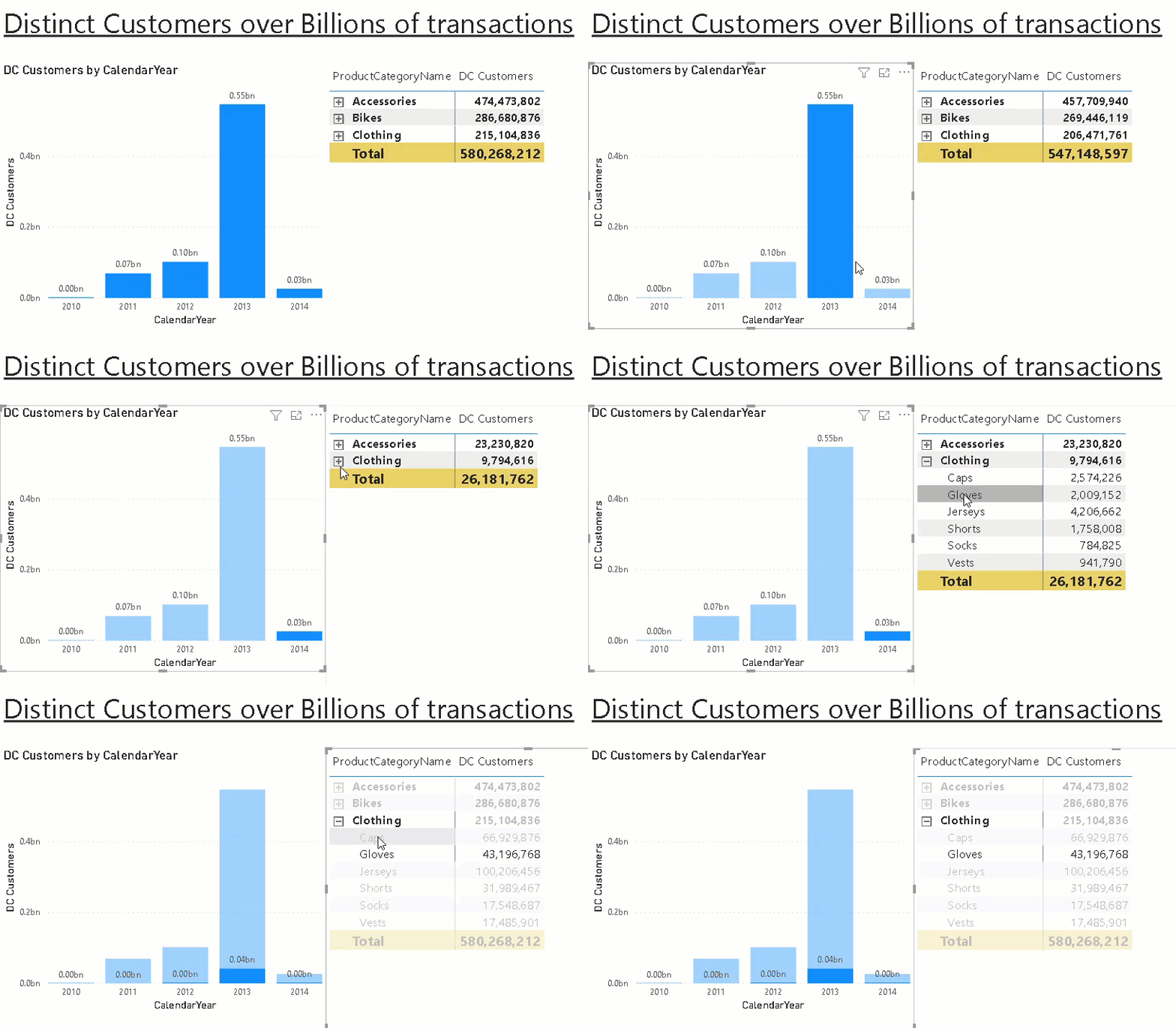
Calculating and visualizing semi- and non-additive measures like distinct count in Power BI is usually not a big deal. However, things can become challenging if your data volume grows and exceeds the limits of Power BI!

In one of my recent projects we wanted to visualize data from the customers analytical platform based on Azure Databricks in Power BI. The connection between those two tools works pretty flawless which I also described in my previous post but the challenge was the use-case and the calculations. We wanted to display the distinct customers across various aggregations levels over a billion rows fact table. We came up with different potential solutions all having their pros and cons:
- load all data into Power BI (import mode) and do the aggregations there
- use Power BI with direct query and let the back-end do the heavy lifting
- load only necessary pre-aggregated data into Power BI (import mode)
Please keep in mind that we are dealing with a distinct count measure here. Semi- and Non-additive measure like this cannot easily be aggregated from lower levels to higher levels without having all the detail data available!
Option 1. has the obvious drawback that data model would be huge in size as we were dealing with billions of transactions. This would have exceeded our current size limits for Power BI data models.
Option 2. would usually work fine, but again, for the amount of data we were dealing with the back-end was just no able to provide sub-second latency that was required.
So we went for Option 3. and did the various aggregations on the different levels in Azure Databricks and loaded only the final results to Power BI. First we wanted to use Power BI Aggregations and Composite Models. Unfortunately, this did not work out for us as we were not in control which aggregation table (we had multiple for the different aggregation levels) was used by the engine which potentially resulted in wrong results when additional aggregation was done in Power BI. Also, when slicing for random aggregation levels, Power BI was querying the details in direct query mode causing very poor query performance.
After some further thinking we came up with a new solution which was also based on pre-calculated aggregations but not realized using built-in aggregation tables but having a combined table for all aggregations and some very straight-forward DAX to select the row we wanted! In the end the whole solution consisted of one SQL view using COUNT(DISTINCT xxx) aggregation and GROUP BY GROUPING SETS (T-SQL, Databricks, … supported in all major SQL engines) and a very simple DAX measure!
Here is a little example that illustrates the approach. Assume you want to calculate the distinct customers that bought certain products in a subcategory/category by year. The first step is to create a view that provides this information:
SELECT
	od.[CalendarYear] AS [Year],
	dp.[ProductSubcategoryKey] AS [ProductSubcategoryKey],
	dp.[ProductCategoryKey] AS [ProductCategoryKey],
	COUNT(DISTINCT CustomerKey) AS [DC_Customers]
FROM [dbo].[FactInternetSales] fis
INNER JOIN [dbo].[vDimProductHierarchy] dp
	ON fis.[ProductKey] = dp.[ProductKey]
INNER JOIN dbo.[DimDate] od
	ON fis.[OrderDatekey] = od.[DateKey]
GROUP BY
GROUPING SETS (
	(),
	(od.[CalendarYear]),
	(od.[CalendarYear], dp.[ProductSubcategoryKey], dp.[ProductCategoryKey]),
	(od.[CalendarYear], dp.[ProductCategoryKey]),
	(dp.[ProductSubcategoryKey], dp.[ProductCategoryKey]),
	(dp.[ProductCategoryKey])
)
Please note that when we have a natural relationship between hierarchy levels (= only 1:n relationships) we need to specify the current level and also all upper levels to allow a proper drill-down later on! E.g. ProductCategory (1 -> n) ProductSubcategory

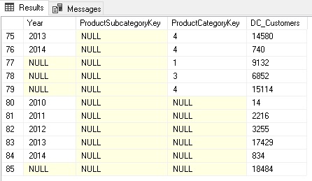
This calculates all the different aggregation levels we need. Columns with NULL mean they were not filtered/grouped by when calculating the aggregation.
Rows 80-84 contain the aggregations grouped by Year only whereas rows 77-79 contain only aggregates by ProductCategoryKey. The rows 75-76 were aggregated by Year AND ProductCategoryKey.
Depending on your final report layout, you may not need all of them and you should consider removing those that are not needed!
This table is then loaded into Power BI. You can either use a custom SQL query like above in Power BI directly or create a view in the back-end system which would be my preferred solution. Alternatively you can also create all these grouping sets using Power Query/M. The incredible Imke Feldmann (t, b) came up with a solution that allows you to specify the grouping sets in a similar way as in SQL and do all this magic within Power BI directly! I hope she will blog about it pretty soon!
(The sample workbook at the end of this post also contains a little preview of this M-magic.)
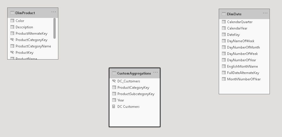
Now that we have all the data we need in Power BI, we need to display the right values for the selections in the report which of course can be dynamic. That’s a bit tricky but once you understand the concept, it is pretty straight forward. First of all, the table containing the aggregations must not be related to any other table as we build them on the fly within our DAX measure. The table itself can also be hidden.

And this is the final DAX for our measure:
DC Customers =
VAR _sel_SubcategoryKey = SELECTEDVALUE(DimProduct[ProductSubcategoryKey])
VAR _sel_CategoryKey = SELECTEDVALUE(DimProduct[ProductCategoryKey])
VAR _sel_Year = SELECTEDVALUE(DimDate[CalendarYear])
VAR _tbl_Agg = CALCULATETABLE(
    'CustomAggregations',
    TREATAS({_sel_SubcategoryKey}, CustomAggregations[ProductSubcategoryKey]),
    TREATAS({_sel_CategoryKey}, CustomAggregations[ProductCategoryKey]),
    TREATAS({_sel_Year}, CustomAggregations[Year])
)
VAR _AggCount = COUNTROWS(_tbl_Agg)
RETURN
    IF(_AggCount = 1, MAXX(_tbl_Agg, [DC_Customers]), _AggCount * -1)
The first part is to get all the selected values of the lookup/dimension tables the user selects on the report. These are all the _sel_XXX variables. SELECTEDVALUE() returns the selected value if only one item is in the current filter context and BLANK()/NULL otherwise. We then use TREATAS() to apply those filters (either a single item or NULL) to our aggregations table. This should usually only return a table with a single row so we can use MAXX() to get our actual value from that one row. I also added a check in case multiple rows are returned which can potentially happen if you use multi-selects in your filters and instead of showing wrong values I’d rather indicate that there is something wrong with the calculation.
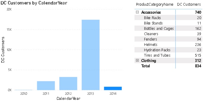
The measure can then be sliced and diced by our pre-defined aggregation levels as if it would be a regular measure but instead of having to process those expensive calculations on the fly we use the pre-calculated aggregates!

One thing to be aware of is that it will produce wrong results if multiple items for any of the aggregation levels are selected so it is highly recommended to set all slicers/filters to single select only or ensure that the filtered aggregation levels are also used in the chart. In this case only the grand total will show wrong values or NULL then.
This could also be fixed in the DAX measure by checking how many rows are actually selected for each level and throw an error in case it is used in a filter and the count of values is > 1.
I did some further thinking and this approach could probably also be used to mimic custom roll-ups and unary operators we know from Analysis Services Multidimensional cubes. If I find some proper examples and this turns out to be feasibly I will write another blog post about it!