Using Power BI Field Parameters to translate Data and Values

When building an enterprise reporting solution with Power BI, a question that always comes up is how to handle translations. Large enterprises operate in various countries where people also speak different languages. So a report should be available in all frequently used languages. Ideally, you just create a report once and then a user can decide (or it is decided for him) in which language the report is displayed.

Power BI only partially supports this scenario and the closest we could get *before field parameters* were introduced is already very well described by Chris Webb’s blog post on Implementing Data (As Well As Metadata) Translations In Power BI – a must-read if you need to deal with translations in Power BI. Another good read on the topic is the blog post Multilingual Reports in Power BI from PBI Guy.

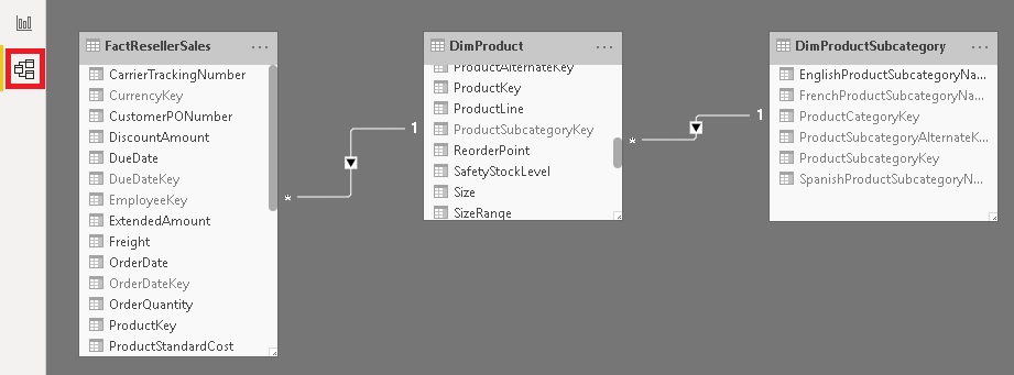
As you will quickly realize, the translation of metadata is already pretty easy as it is baked into the engine. Unfortunately this is not the case when you need to translate actual data values (e.g. product names, …). In the multidimensional version of Analysis Services this just worked like a charm as it was also a native feature but this feature never made it to Analysis Services Tabular Models, Azure Analysis Services or Power BI.

The current approaches when it comes to data and value translations are more workarounds than actual solutions. They probably work fine for small data models and very specific use-cases but usually fall short in performance, usability or maintainability when implemented on a larger scale enterprise models.

The recently introduced Field Parameters in Power BI give us a bit more flexibility here and another potential solution to implement data and value translations in Power BI.

Here is what we want to achieve:

  • create a single report only
  • support for multiple languages – metadata and column data
  • only minor changes to the existing data model

How can Field Parameters help here?

Field Parameters allow you to select the columns you want to display in your report/visual on-the-fly. Based on the selection, the reporting engine decides which physical column(s) it needs to use in the query it generates and sends to the data model.
So we can create a Field Parameter for the different columns that hold the translated data values and already easily switch the language by changing the selection of our Field Parameter. This is how our Filed Parameter would be defined:

I did this for all the fields for which translated values are actually provided. Usually this is just a very small subset of all the available columns!

As you can see, Field Parameters allow you to translate the metadata (first value) and also to define the column to use for the data values (second value, using NAMEOF() function).

To change all field parameters at once I introduced an additional 4th column that holds the culture/language of the current row which is then linked to another static DAX table that is defined as follows:

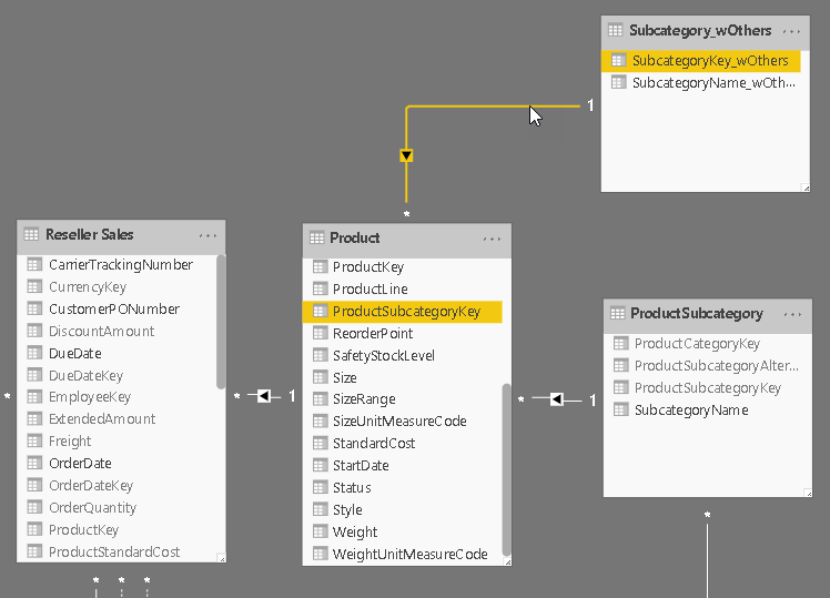
Then relationships are set up between these tables:

In your report you can now simply use the column from the field parameters and add a slicer for the Language table to control which language is displayed. Note: this must be a single-select slicer as otherwise Power BI will build a hierarchy of the different languages!

Here is the final result:

(please use Full Screen mode from bottom right corner)

As you can see, we just created a single report that supports multiple languages for both, metadata and data values, allows you to easily switch between them and provides similar performance as if you would have built the report for a single language only!

There are still some open questions when it comes to translating all the labels used on the whole report which is already partially covered in the other blog posts referenced above but this approach brings us another step further to a fully translatable report.

Another nice feature of this approach is that you can also put security on top of the Language/Culture table so a user only sees exactly one row – the one with the language/culture of his choice or country. So a user would not even need to select the language but it would be selected for him automatically!
Ideally you could even use the USERCULTURE() DAX function but unfortunately this is currently not supported in the PBI service. There is already an open idea for which you can vote if this is important to you.
USERCULTUER() DAX function is now finally general available also in the service: https://powerbi.microsoft.com/en-us/blog/userculture-dax-function-now-supported-in-power-bi-premium/

The .pbix file can be downloaded here: PBI_Translations.pbix

Data Virtualization in Microsoft Power BI – Part 2

In my previous post I showed how you can use Microsoft Power BI to create a Data Virtualization layer on top of multiple relational data sources querying them all at the same time through one common model. As I already mentioned in the post and what was also pointed out by Adam Saxton (b, t) in the comments is the fact, that this approach can cause serious performance problems at the data source and also on the Power BI side. So in this post we will have a closer look on what actually happens in the background and which queries are executed when you join different data sources on-the-fly.

We will use the same model as in the previous post (you can download it from there or at the end of this post) and run some basic queries against it so we can get a better understanding of the internals.
Here is our relationship diagram again as a reference. Please remember that each table comes from a different SQL server:

Relationships

In our test we will simply count the number of products for each Product Subcategory:

NumberOfProducts_by_SubCategory

Even though this query only touches two different data sources, it is a good way to analyze the queries sent to the data sources. To track these queries I used the built-in Performance Analyzer of Power BI desktop which can be enabled on the “View”-tab. It gives you detailed information about the performance of the report including the actual SQL queries (under “Direct query”) which were executed on the data sources. The plain text queries can also be copied using the “Copy queries” link at the bottom. In our case 3 SQL queries were executed against 2 different SQL databases:

Query 1:

Result:
Results_Query1

The query basically selects two columns from the DimProductSubcategory table:

  1. ProductSubcategoryKey – which is used in the join with DimProduct
  2. ProductSubcategoryName – which is the final name to be displayed in the visual

The inner sub-select (line 7-14) represents the original Power Query query. It selects all columns from the DimProductSubcategory table and renames [EnglishProductSubcagetoryName] to [ProductSubcategoryName] (line 10). Any other Power Query steps that are supported in direct query like aggregations, groupings, filters, etc. would also show up here.

Query 2 (shortened):

(The query was shortened at line 16 and line 29 as the removed columns/rows are not relevant for the purpose of this example.)

Similar to Query 1 above, the innermost sub-select (line 13-17) in the FROM clause returns the results of the Power Query query for DimProduct whereas the outer sub-select (line 7-20) groups the result by the common join-key [ProductSubcategoryKey].
This result is then joined with a static table which is made up from hard-coded SELECTs and UNION ALLs (line 24-30). If you take a closer look, you will realize that this table actually represents the original result of Query 1! Additionally it also includes a special NULL-item (line 30) that is used to handle non-matching entries.
The last step is to group the joined tables to obtain the final results.

Query 3 (shortened):

(The query was shortened at line 9 as the removed columns/rows are not relevant for the purpose of this example.)

The last query is necessary to display the correct grand total across all products and product sub-categories.

As you can see, most of the “magic” happens in Query 2. The virtual join or virtualization is done by hard-coding the results of the remote table/data source directly into the SQL query of the current table/data source. This works fine as long as the results of the remote query are small enough – both, in terms of numbers of rows and columns – but the more limiting factor is the number of rows. Roughly speaking, if you have more than thousand items that are joined this way, the queries tend to get slow. In reality this will very much depend on your data so I would highly recommend to test this with your own data!

I ran a simple test and created a join on the SalesOrderNumber which has about 27,000 distinct items. The query never returned any results and after having a look at the Performance Analyzer I realized, that the query similar to Query 2 above was never executed. I do not know yet whether this is because of the large number of items and the very long SQL query that is generated (27,000 times SELECT + UNION ALL !!!) or a bug.

At this point you may ask yourself if it makes sense to use Power BI for data virtualization or use another tool that was explicitly designed for this scenario. (Just google for “data virtualization”). These other tools may perform better even on higher volume data but they will also reach their limits if the joins get too big and, what is even more important, the are usually quite expensive.

So I think that Power BI is still a viable solution for data virtualization if you keep the following things in mind:
– keep the items in the join columns at a minimum
– use Power Query to pre-aggregate the data if possible
– don’t expect too much in terms of performance
– only use it when you know what you are doing 🙂

Downloads:

PowerBI_DataVirtualization_Part2.pbix
SQL_Query1.sql
SQL_Query2.sql
SQL_Query3.sql

Power BI – Dynamic TopN + Others with Drill-Down

A very common requirement in reporting is to show the Top N items (products, regions, customers, …) and this can also be achieved in Power BI quite easily.

But lets start from the beginning and show how this requirement usually evolves and how to solve the different stages.

The easiest thing to do is to simply resize the visual (e.g. table visual) to only who 5 rows and sort them descending by your measure:

This is very straight forward and I do not think it needs any further explanation.

The next requirement that usually comes up next is that the customer wants to control, how many Top items to show. So they implement a slicer and make the whole calculation dynamic as described here:
SQL BI – Use of RANKX in a Power BI measure
FourMoo – Dynamic TopN made easy with What-If Parameter

Again, this works pretty well and is explained in detail in the blog posts.

Once you have implemented this change the business users usually complain that Total is wrong. This depends on how you implemented the TopN measure and what the users actually expect. I have seen two scenarios that cause confusion:
1) The Total is the SUM of the TopN items only – not reflecting the actual Grand Total
2) The Total is NOT the SUM of the TopN items only – people complaining that Power BI does not sum up correctly

As I said, this pretty much depends on the business requirements and after discussing that in length with the users, the solution is usually to simply add an “Others” row that sums up all values which are not part of the TopN items. For regular business users this requirement sounds really trivial because in Excel the could just add a new row and subtract the values of the TopN items from the Grand Total.

However, they usually will not understand the complexity behind this requirement for Power BI. In Power BI we cannot simply add a new “Others” row on the fly. It has to be part of the data model and as the TopN calculations is already dynamic, also the calculation for “Others” has to be dynamic. As you probably expected, also this has been covered already:
Oraylis – Show TopN and rest in Power BI
Power BI community – Dynamic Top N and Others category

These work fine even if I do not like the DAX as it is unnecessarily complex (from my point of view) but the general approach is the same as the one that will I show in this blog post and follows these steps:
1) create a new table in the data model (either with Power Query or DAX) that contains all our items that we want to use in our TopN calculation and an additional row for “Others”
2) link the new table also to the fact table, similar to the original table that contains your items
3) write a measure that calculates the rank for each item, filters the TopN items and assigns the rest to the “Others” item
4) use the new measure in combination with the new table/column in your visual

Step 1 – Create table with “Others” row

I used a DAX calculated table that does a UNION() of the existing rows for the TopN calculation and a static row for “Others”. I used ROW() first so I can specify the new column names directly. I further use ALLNOBLANKROW() to remove to get rid of any blank rows.

Step 2 – Create Relationship

The new table is linked to the same table to which the original table was linked to. This can be the fact-table directly or an intermediate table that then filters the facts in a second step (as shown below)

Step 3 – Create DAX measure

That’s actually the tricky part about this solution, but I think the code is still very easy to read and understand:

Step 4 – Build Visual

One of the benefits of this approach is that it also allows you to use the “Others” value in slicers, for cross-filtering/-highlight and even in drill-downs. To do so we need to configure our visual with two levels. The first one is the column that contains the “Others” item and the second level is the original column that contains the items. The DAX measure will take care of the rest.

And that’s it! You can now use the column that contains the artificial “Others” in combination with the new measure wherever you like. In a slicer, in a chart or in a table/matrix!

The final PBIX workbook can also be downloaded: TopN_Others.pbix

Storing Images in a PowerBI/Analysis Services Data Models

As some of you probably remember, when PowerPivot was still only available in Excel and Power Query did not yet exist, it was possible to load images from a database (binary column) directly into the data model and display them in PowerView. Unfortunately, this feature did not work anymore in PowerBI Desktop and the only way to display images in a visual was to provide the URL of the image which is public accessible. The visual would then grab the image on-the-fly from the URL and render it. This of course has various drawbacks:

  • The image needs to be available via a public URL (e.g. upload it first to an Azure Blob Store)
  • The image cannot be displayed when you are offline
  • The link may break in the future or point to a different image as initially when the model was built

There is also a  feedback items about this issue which I encourage you to vote for: https://ideas.powerbi.com/forums/265200-power-bi-ideas/suggestions/7340150-data-model-image-binary-support-in-reports

Until today I was sure that we have to live with this limitation but then I came across this blog post from Jason Thomas aka SqlJason. He shows a workaround to store images directly in the PowerBI data model and display them in the report as if they were regular images loaded from an URL. This is pretty awesome and I have to dedicate at least 99.9% of this blog post to Jason and his solution!

However, with this blog post I would like to take Jasons’ approach a step further. He creates the Base64 string externally and hardcodes it in the model using DAX. This has some advantages (static image, no external dependency anymore, …) but also a lot of disadvantages (externally create the Base64 string, manually copy&paste the Base64 string for each image, hard to maintain, cannot dynamically add images …). For scenarios where you have a local folder with images, a set of [private] URLs pointing to images or images stored in a SQL table (as binary) which you want to load into your PowerBI data model, this whole process should be automated and ideally done within PowerBI.

PowerBI_Images_Stored_Sample

Fortunately, this turns out to be quite simple! Power Query provides a native function to convert any binary to a Base64 encoded string: Binary.ToText() . The important part to point out here is to use the second parameter which allows you to set the encoding of the resulting text. It supports two values: BinaryEncoding.Base64 (default) and BinaryEncoding.Hex. Once we have the Base64 string, we simply need to prefix it with the following meta data: “data:image/jpeg;base64, “

To make it easy, I wrote to two custom PowerQuery functions which convert and URL or a binary image to the appropriate string which can be used by PowerBI:

If your images reside in a local folder, you can simply load them using the “Folder” data source. This will give you a list of all images and and their binary content as separate column. Next add a new Custom Column where you call the above function to convert the binary to a prefixed Base64 string which can then be displayed in PowerBI (or Analysis Services) as a regular image. Just make sure to also set the Data Category of the column to “Image URL”:PowerBI_Image_URL_Base64

And that’s it, now your visual will display the image stored in the data model without having to access any external resources!

Caution: As Jason also mentions at the end of his blog post, there is an internal limitation about the size of a text column. So this may cause issues when you try to load high-resolution images! In this case, simply lower the size/quality of the images before you load them.
UPDATE May 2019: Chris Webb provides much more information and a solution(!) to this issue in his blog post: https://blog.crossjoin.co.uk/2019/05/19/storing-large-images-in-power-bi-datasets

Download: StoreImageInPbiModel.pbix
This PowerBI Desktop model contains all samples from above including the PowerQuery functions!

Calculating Pearson Correlation Coefficient using DAX

The original request for this calculation came from one of my blog readers who dropped me a mail asking if it possible to calculated the Pearson Correlation Coefficient (PCC or PPMCC) in his PowerPivot model. In case you wonder what the Pearson Correlation Coefficient is and how it can be calculated – as I did in the beginning –  these links What is PCC, How to calculate PCC are very helpful and also offer some examples and videos explaining everything you need to know about it. I highly recommend to read the articles before you proceed here as I will not go into the mathematical details of the calculation again in this blog which is dedicated to the DAX implementation of the PCC.

UPDATE 2017-06-04:
Daniil Maslyuk posted an updated version of the final calculation using DAX 2.0 which is much more readable as it is using variables instead of separate measures for every intermediate step. His blog post can be found at https://xxlbi.com/blog/pearson-correlation-coefficient-in-dax/

Anyway, as I know your time is precious, I will try to sum up its purpose for you: “The Pearson Correlation Coefficient calculates the correlation between two variables over a given set of items. The result is a number between -1 and 1. A value higher than 0.5 (or lower than –0.5) indicate a strong relationship whereas numbers towards 0 imply weak to no relationship.”

The two values we want to correlate are our axes, whereas the single dots represent our set of items. The PCC calculates the trend within this chart represented as an arrow above.

The mathematical formula that defines the Pearson Correlation Coefficient is the following:

The PCC can be used to calculate the correlation between two measures which can be associated with the same customer. A measure can be anything here, the age of a customer, it’s sales, the number of visits, etc. but also things like sales with red products vs. sales with blue products. As you can imagine, this can be a very powerful statistical KPI for any analytical data model. To demonstrate the calculation we will try to correlate the order quantity of a customer with it’s sales amount. The order quantity will be our [MeasureX] and the sales will be our [MeasureY], and the set that we will calculate the PCC over are our customers. To make the whole calculation more I split it up into separate measures:

  1. MeasureX := SUM(‘Internet Sales’[Order Quantity])
  2. MeasureY := SUM(‘Internet Sales’[Sales Amount])

Based on these measures we can define further measures which are necessary for the calculation of our PCC. The calculations are tied to a set if items, in our case the single customers:

  1. Sum_XY := SUMX(VALUES(Customer[Customer Id]), [MeasureX] * [MeasureY])
  2. Sum_X2 := SUMX(VALUES(Customer[Customer Id]), [MeasureX] * [MeasureX])
  3. Sum_Y2 := SUMX(VALUES(Customer[Customer Id]), [MeasureY] * [MeasureY])
  4. Count_Items := DISTINCTCOUNT(Customer[Customer Id])

Now that we have calculated the various summations over our base measures, it is time to create the numerator and denominator for our final calculation:

  1. Pearson_Numerator :=
  2.     ([Count_Items] * [Sum_XY]) – ([MeasureX] * [MeasureY])
  3. Pearson_Denominator_X :=
  4.     ([Count_Items] * [Sum_X2]) – ([MeasureX] * [MeasureX])
  5. Pearson_Denominator_Y :=
  6.     ([Count_Items] * [Sum_Y2]) – ([MeasureY] * [MeasureY])
  7. Pearson_Denominator :=
  8.     SQRT([Pearson_Denominator_X] * [Pearson_Denominator_Y])

Having these helper-measures in place the final calculation for our PCC is straight forward:

  1. Pearson := DIVIDE([Pearson_Numerator], [Pearson_Denominator])

This [Pearson]-measure can then be used together with any attribute in our model – e.g. the Calendar Year in order to track the changes of the Pearson Correlation Coefficient over years:

Pearson by Year

For those of you who are familiar with the Adventure Works sample DB, this numbers should not be surprising. In 2005 and 2006 the Adventure Works company only sold bikes and usually a customer only buys one bike – so we have a pretty strong correlation here. However, in 2007 they also started selling Clothing and Accessories which are in general cheaper than Bikes but are sold more often.

Pearson by Year and Category

This has impact on our Pearson-value which is very obvious in the screenshots above.

As you probably also realized, the Grand Total of our Pearson calculation cannot be directly related to the single years and may also be the complete opposite of the single values. This effect is called Simpson’s Paradox and is the expected behavior here.

[MeasuresX] and [MeasureY] can be exchanged by any other DAX measures which makes this calculation really powerful. Also, the set of items over which we want to calculated the correlation can be exchanged quite easily. Below you can download the sample Excel workbook but also a DAX query which could be used in Reporting Services or any other tool that allows execution of DAX queries.

Sample Workbook (Excel 2013): Pearson.xlsx
DAX Query: Pearson_SSRS.dax

Recursive Calculations in PowerPivot using DAX

If you have ever tried to implement a recursive calculations in DAX similar to how you would have done it back in the good old days of MDX (see here) you would probably have come up with a DAX formula similar to the one below:

  1. Sales ForeCast :=
  2. IF (
  3.     NOT ( ISBLANK ( [Sales] ) ),
  4.     [Sales],
  5.     CALCULATE (
  6.         [Sales ForeCast],
  7.         DATEADD ( 'Date'[Calendar], 1, MONTH )
  8.     ) * 1.05
  9. )

However, in DAX you would end up with the following error:

A circular dependency was detected: ‘Sales'[Sales ForeCast],’Sales'[Sales ForeCast].

This makes sense as you cannot reference a variable within its own definition – e.g. X = X + 1 cannot be defined from a mathematical point of view (at least according to my limited math skills). MDX is somehow special here where the SSAS engine takes care of this recursion by taking the IF() into account.

So where could you possible need a recursive calculation like this? In my example I will do some very basic forecasting based on monthly growth rates. I have a table with my actual sales and another table for my expected monthly growth as percentages. If I do not have any actual sales I want to use my expected monthly growth to calculate my forecast starting with my last actual sales:

GeneralLogic

This is a very common requirement for finance applications, its is very easy to achieve in pure Excel but very though to do in DAX as you probably realized on your own what finally led you here Smile

In Excel we would simply add a calculation like this and propagate it down to all rows:
ExcelFormula
(assuming column C contains your Sales, D your Planned Growth Rate and M is the column where the formula itself resides)

In order to solve this in DAX we have to completely rewrite our calculation! The general approach that we are going to use was already explained by Mosha Pasumansky some years back, but for MDX. So I adopted the logic and changed it accordingly to also work with DAX. I split down the solution into several steps:
1) find the last actual sales – April 2015 with a value of 35
2) find out with which value we have to multiply our previous months value to get the current month’s Forecast
3) calculate the natural logarithm (DAX LN()-function) of the value in step 2)
4) Sum all values from the beginning of time until the current month
5) Raise our sum-value from step 4) to the power of [e] using DAX EXP()-function
6) do some cosmetic and display our new value if no actual sales exist and take care of aggregation into higher levels

Note: The new Office 2016 Preview introduces a couple of new DAX functions, including PRODUCTX() which can be used to combine the Steps 3) to 5) into one simple formula without using any complex LN() and EXP() combinations.

Step 1:
We can use this formula to get our last sales:

  1. Last Sales :=
  2. IF (
  3.     ISBLANK (
  4.         CALCULATE (
  5.             [Sales],
  6.             DATEADD ( 'Date'[DateValue], 1, MONTH )
  7.         )
  8.     ),
  9.     [Sales],
  10.     1
  11. )

It basically checks if there are no [Sales] next month. If yes, we use the current [Sales]-value as our [Last Sales], otherwise we use a fixed value of 1 as a multiplication with 1 has no impact on the final result.

Step 2:
Get our multiplier for each month:

  1. MultiplyBy :=
  2. IF (
  3.     ISBLANK ( [Last Sales] ),
  4.     1 + [Planned GrowthRate],
  5.     [Last Sales]
  6. )

If we do not have any [Last Sales], we use our [Planned GrowthRate] to for our later multiplication/summation, otherwise take our [Last Sales]-value.

Step 3 and 4:
As we cannot use “Multiply” as our aggregation we first need to calculate the LN and sum it up from the first month to the current month:

  1. Cumulated LN :=
  2. CALCULATE (
  3.     SUMX ( VALUES ( 'Date'[Month] ), LN ( [MultiplyBy] ) ),
  4.     DATESBETWEEN (
  5.         'Date'[DateValue],
  6.         BLANK (),
  7.         MAX ( 'Date'[DateValue] )
  8.     )
  9. )


Step 5 and 6:
If there are no actual sales, we display our calculated Forecast:

  1. Sales ForeCast :=
  2. SUMX (
  3.     VALUES ( 'Date'[Month] ),
  4.     IF ( ISBLANK ( [Sales] ), EXP ( [Cumulated LN] ), [Sales] )
  5. )

Note that we need to use SUMX over our Months here in order to also get correct subtotals on higher levels, e.g. Years. That’s all the SUMX is necessary for, the IF itself should be self-explaining here.


So here is the final result – check out the last column:
FinalPivot

The calculation is flexible enough to handle missing sales. So if for example we would only have sales for January, our recursion would start there and use the [Planned GrowthRate] already to calculate the February Forecast-value:
FinalPivot2

Quite handy, isn’t it?

The sample-workbook (Excel 365) can be downloaded here: RecursiveCalculations.xlsx

Excel CUBE-Functions and MDX UniqueNames

Two weeks ago at the German SQL Server Conference 2015 I was at Peter Myer’s session about Mastering the CUBE Functions in Excel. (PS: Peter is also speaking on our upcoming SQLSaturday #374 in Vienna next week and at PASS SQLRally in Copenhagen the week after). After his session we had a further discussion about this topic and our experiences on how to use Excels CUBE-functions in order to build nice Dashboards with native Excel functionalities that also work with e.g. Excel Services. Its always great to exchange with people that share the same passion on he same topic! One thing we both agreed on that is missing currently is a way to get the MDX UniqueName of something that is selected in a slicer, filter or simply in a cell using CUBEMEMBER-function. I once used a special Cube Measure which was created in MDX Script which returned the UniqueName of a given member that was selected together with this special measure. For this to work with Excel you need to know how Excel builds the MDX when querying cube values using CUBEVALUE-function. Here is a little example:
Excel_CubeValue_Formula
This produces the following MDX query:

  1. SELECT
  2. {
  3.     (
  4.         [Measures].[Internet Sales Amount],
  5.         [Product].[Category].&[1]
  6.     )
  7. } ON 0
  8. FROM [Adventure Works]
  9. CELL PROPERTIES VALUE, FORMAT_STRING, LANGUAGE, BACK_COLOR, FORE_COLOR, FONT_FLAGS

So it basically creates a tuple that contains everything you pass into the CUBEVALUE-Function as a parameter. Knowing this we can create a calculated measure to get the MDX UniqueName of this tuple using MDX StrToTuple()- and MDX AXIS()-function:

  1. MEMBER [Measures].[Excel TupleToStr] AS (
  2. TupleToStr(axis(0).item(0))
  3. )

Replacing the [Measures].[Internet Sales Amount] of our initial CUBEVALUE-function with this new measure would return this to Excel:

  1. ([Measures].[Internet Sales Amount],[Product].[Category].&[1])


Ok, so far so good but nothing really useful as you need to hardcode the member’s UniqueName into the CUBEVALUE-function anyway so you already know the UniqueName.
However, this is not the case if you are dealing with Pivot Table Page Filters and/or Slicers! You can simply refer to them within the CUBEVALUE-function but you never get the UniqueName of the selected item(s). Well, at least not directly! But you can use the approach described above, using an special MDX calculated measure, to achieve this as I will demonstrate on the next pages.

Calculated measures can only be created using the Pivot Table interface but can also be used in CUBE-functions. So first thing you need to do is to create a Pivot Table and add a new MDX Calculated Measure:
Excel_Create_MDX_calculated_measure

!Caution! some weird MDX coming !Caution!


Excel_Create_MDX_calculated_measure2

You may wonder, why such a complex MDX is necessary and what it actually does. What it does is the following: Based on the example MDX query that Excel generates (as shown above) this is a universal MDX that returns the MDX UniqueName of any other member that is selected together with our measure using the CUBEVALUE-function. It also removes the UniqueName of the measure itself so the result can be used again with any other measure, e.g. [Internet Sales Amount]
The reason why it is rather complex is that Excel may group similar queries and execute them as a batch/as one query to avoid too many executions which would slow down the overall performance. So we cannot just reference the first element of our query as it may belong to any other CUBEVALUE-function. This MDX deals with all this kinds of issues.

The MDX above allows you to specify only two additional filters but it may be extended to any number of filters that you pass in to the CUBEMEMBER-function. This would be the general pattern:

  1. MID(
  2.   IIf(axis(0).item(0).count > 0 AND
  3.         NOT(axis(0).item(0).item(0).hierarchy IS [Measures]),
  4.     "," + axis(0).item(0).item(0).hierarchy.currentmember.uniquename,
  5.     "")
  6. + IIf(axis(0).item(0).count > 1 AND
  7.         NOT(axis(0).item(0).item(1).hierarchy IS [Measures]),
  8.     "," + axis(0).item(0).item(1).hierarchy.currentmember.uniquename,
  9.     "")
  10. + IIf(axis(0).item(0).count > n AND
  11.         NOT(axis(0).item(0).item(n).hierarchy IS [Measures]),
  12.     "," + axis(0).item(0).item(n).hierarchy.currentmember.uniquename,
  13.     "")
  14. , 2)

After creating this measure we can now use it in our CUBE-functions in combination with our filters and slicers:
Excel_MDX_CUBEVALUE_UniqueNames_Filter
Excel_MDX_CUBEVALUE_UniqueNames_Slicer

You may noted that I had to use CUBERANKEDMEMBER here. This is because filters and slicers always return a set and if we would pass in a set to our CUBEVALUE function a different MDX query would be generated which would not allow us to extract the single UniqueNames of the selected items using the approach above (or any other MDX I could think of). So, this approach currently only works with single selections! I hope that the Excel team will implement a native function to extract the UniqueName(s) of the selected items in the future to make this workaround obsolete!

Once we have our UniqeName(s) we can now use them in e.g. a CUBESET-function to return the Top 10 days for a given group of product (filter) and the selected year (slicer):
Excel_MDX_CUBESET_TopCount

And that’s it!

So why is this so cool?

  • It works with SSAS (multidimensional and tabular) and Power Pivot as Excel still uses MDX to query all those sources. It may also work with SAP HANA’s ODBO connector but I have not tested this yet!
  • It does not require any VBA which would not work in Excel Services – this solution does!
  • The calculation is stored within the Excel Workbook so it can be easily shared with other users!
  • There is no native Excel functionality which would allow you to create a simple Top 10 report which works with filters and slicers as shown above or any more complex dynamic report/dashboard with any dynamic filtering.

So no more to say here – Have fun creating your interactive Excel web dashboards!

Download sample Workbook: Samples.xlsx

Note: You may also rewrite any TOPCOUNT expression and use the 4th and 5h parameter of the CUBESET-function instead. This is more native and does not require as much MDX knowledge:Excel_MDX_CUBESET_TopCount_Native
However, if you are not familiar with MDX, I highly recommend to learn it before you write any advanced calculations as show above as otherwise the results might be a bit confusing in the beginning! Especially if you filter and use TOPCOUNT on the same dimension!

Dynamic ABC Analysis in Power Pivot using DAX – Part 2

Almost two years ago I published the first version of an Dynamic ABC Analysis in Power Pivot and by now it is the post with the most comments among all my blog posts. This has two reason:
1) the formula was quite complex and not easy to understand or implement
2) the performance was not really great with bigger datasets

When the first of those comments flew in, I started investigating into a new, advanced formula. At about the same time Marco Russo and Alberto Ferrari published their ABC Classification pattern – a static version using calculated columns – at www.daxpatterns.com. When I had my first dynamic version ready I sent it to Marco and Alberto and asked if they are interested in the pattern and if I can publish it on their website. Long story short – this week the new pattern was released and can now be found here:

ABC Classification – Dynamic

It got some major performance improvements and was also designed towards reusability with other models. The article also contains some detailed explanations how the formula actually works but its still very hard DAX which will take some time to be fully understood. The pattern also features some extended versions to address more specific requirements but I think its best to just read the article on your own.

Hope you enjoy it!

Events-In-Progress for Time Periods in DAX

Calculating the Events-In-Progress is a very common requirement and many of my fellow bloggers like Chris Webb, Alberto Ferrari and Jason Thomas already blogged about it and came up with some really nice solutions. Alberto also wrote a white-paper summing up all their findings which is a must-read for every DAX and Tabular/PowerPivot developer.
However, I recently had a slightly different requirement where I needed to calculate the Events-In-Progress for Time Periods – e.g. the Open Orders in a given month – and not only for a single day. The calculations shown in the white-paper only work for a single day so I had to come up with my own calculation to deal with this particular problem.

Before we can start we need to identify which orders we actually want to count if a Time Period is selected. Basically we have to differentiate between 6 types of Orders for our calculation and which of them we want to filter or not:
Overview_EventsInProgress_TimeFrame

Order Definition
Order1 (O1) Starts before the Time Period and ends after it
Order2 (O2) Starts before the Time Period and ends in it
Order3 (O3) Starts in the Time Period and ends after it
Order4 (O4) Starts and ends in the Time Period
Order5 (O5) Starts and ends after the Time Period
Order6 (O6) Starts and ends before the Time Period

For my customer an order was considered as “open” if it was open within the selected Time Period, so in our case we need to count only Orders O1, O2, O3 and O4. The first calculation you would usually come up with may look like this:

  1. [MyOpenOrders_FILTER] :=
  2. CALCULATE (
  3.     DISTINCTCOUNT ( ‘Internet Sales’[Sales Order Number] ),
  4.     FILTER (
  5.         ‘Internet Sales’,
  6.         ‘Internet Sales’[Order Date]
  7.             <= CALCULATE ( MAX ( ‘Date’[Date] ) )
  8.     ),
  9.     FILTER (
  10.         ‘Internet Sales’,
  11.         ‘Internet Sales’[Ship Date]
  12.             >= CALCULATE ( MIN ( ‘Date’[Date] ) )
  13.     )
  14. )

We apply custom filters here to get all orders that were ordered on or before the last day and were also shipped on or after the first day of the selected Time Period. This is pretty straight forward and works just fine from a business point of view. However, performance could be much better as you probably already guessed if you read Alberto’s white-paper.

So I integrate his logic into my calculation and came up with this formula (Note that I could not use the final Yoda-Solution as I am using a DISTINCTCOUNT here):

  1. [MyOpenOrders_TimePeriod] :=
  2. CALCULATE (
  3.     DISTINCTCOUNT ( ‘Internet Sales’[Sales Order Number] ),
  4.     GENERATE (
  5.         VALUES ( ‘Date’[Date] ),
  6.         FILTER (
  7.             ‘Internet Sales’,
  8.             CONTAINS (
  9.                 DATESBETWEEN (
  10.                     ‘Date’[Date],
  11.                     ‘Internet Sales’[Order Date],
  12.                     ‘Internet Sales’[Ship Date]
  13.                 ),
  14.                 [Date], ‘Date’[Date]
  15.             )
  16.         )
  17.     )
  18. )

To better understand the calculation you may want to rephrase the original requirement to this: “An open order is an order that was open on at least one day in the selected Time Period”.

I am not going to explain the calculations in detail again as the approach was already very well explained by Alberto and the concepts are the very same.

An alternative calculation would also be this one which of course produces the same results but performs “different”:

  1. [MyOpenOrders_TimePeriod2] :=
  2. CALCULATE (
  3.     DISTINCTCOUNT ( ‘Internet Sales’[Sales Order Number] ),
  4.     FILTER (
  5.         GENERATE (
  6.             SUMMARIZE (
  7.                 ‘Internet Sales’,
  8.                 ‘Internet Sales’[Order Date],
  9.                 ‘Internet Sales’[Ship Date]
  10.             ),
  11.             DATESBETWEEN (
  12.                 ‘Date’[Date],
  13.                 ‘Internet Sales’[Order Date],
  14.                 ‘Internet Sales’[Ship Date]
  15.             )
  16.         ),
  17.         CONTAINS ( VALUES ( ‘Date’[Date] ), [Date], ‘Date’[Date] )
  18.     )
  19. )

I said it performs “different” as for all DAX calculations, performance also depends on your model, the data and the distribution and granularity of the data. So you should test which calculation performs best in your scenario. I did a simple comparison in terms of query performance for AdventureWorks and also my customer’s model and results are slightly different:

Calculation (Results in ms)   AdventureWorks   Customer’s Model
[MyOpenOrders_FILTER]                   58.0              1,094.0
[MyOpenOrders_TimePeriod]                   40.0                  390.8
[MyOpenOrders_TimePeriod2]                   35.5                  448.3

As you can see, the original FILTER-calculation performs worst on both models. The last calculation performs better on the small AdventureWorks-Model whereas on my customer’s model (16 Mio rows) the calculation in the middle performs best. So it’s up to you (and your model) which calculation you should prefer.

The neat thing is that all three calculations can be used with any existing hierarchy or column in your Date-table and of course also on the Date-Level as the original calculation.

Download: Events-in-Progress.pbix

Restoring a SSAS Tabular Model to Power Pivot

It is a very common scenario to create a SSAS Tabular Model out of an Power Pivot Model contained in an Excel workbook. Microsoft even created an wizard (or actually a separate Visual Studio project) that supports you doing this. Even further, this process is also a major part of Microsoft’s strategy to cover Personal BI, Team BI and Corporate BI within one technology being xVelocity. This all works just fine but there may also be scenarios where you need to do it the other way round – converting a Tabular model to Power Pivot. Several use-cases come into my mind but I am sure that the most important one is to making data available offline for e.g. sales people to take it with them on their every day work. And in this blog post I will show how this can be done!

But before taking a closer look into how this can be accomplished, lets first see how the import from Power Pivot to SSAS Tabular works. To do this start SQL Server Profiler and connect to your tabular instance. Then create a new Tabular project in Visual Studio based on an existing Power Pivot workbook. At this point you will notice a lot of events happening on our SSAS Tabular server. The most important event for us is “Command End” with the EventSubclass “9 – restore”:
RestoreFromPowerPivot

SSAS actually restores a backup from a “Model.abf” backup file which is located in our project directory that we just created:
BackupExtractedFromPowerPivot

So far so good – but where does this file come from?

Well, the origin of the file has to be our Excel workbook that we imported. Knowing that all new office formats ending with “x” (.xlsx, .docx, …) are basically ZIP files, we can inspect our original Excel workbook by simply rename it to “.zip”. This allows us to browse the Excel file structure:
ExcelUnzipped

We will find a folder called “xl” which contains a sub-folder called “model”. This folder contains one item called “item.data”. If you take a closer look at the file size you may realize that both, the “Model.abf” file that we restored and the “item.data” file from our Excel workbook have the exact same size:
FileProperties

A Coincidence? Not really!

What happens behind the scenes when you import a Power Pivot model into SSAS Tabular is that this “item.data” file gets copied into your project directory and is renamed to “Model.abf” and then restored to the SSAS Tabular workspace instance by using an standard database restore.

Having this information probably makes you think: If it works in one direction, why wouldn’t it also work the other way round? And it does!

So here are the steps that you need to do in order to restore your SSAS Tabular backup into an Excel Power Pivot workbook:

  1. Create a backup of your SSAS Tabular database and rename it to “item.data”
  2. Create an empty Excel workbook and add a simple linked table to the Excel data model (which is actually Power Pivot).
    This is necessary to tell Excel that the workbook contains a Power Pivot model which has to be loaded once the file is opened.
  3. Close the Excel workbook and rename it from “MyFile.xlsx” to “MyFile.xlsx.zip”
  4. Open the .zip-file in Windows Explorer and locate the “\xl\model\”-folder
  5. Replace the “item.data” file with the file that you created in step 1.
  6. Rename the .zip-file back to “MyFile.xlsx”
  7. Open the Excel Workbook
  8. Voilá! You can now work with the data model as with any other Power Pivot model!

I tested this with a SSAS Tabular backup from SQL Server 2012 SP1 being restored to the streamed version of Excel from Office 365 with the latest version of Power Pivot. I assume that it also works with older versions but have not tested all combinations yet.

There are also some features that will not work, for example roles. If your Tabular database contains roles you will not be able to use this approach. Excel will complain that the Power Pivot model is broken. However, other Tabular features like partitions actually work with the little limitation that you cannot change them later on in the Power Pivot model or process them separately:
PowerPivotPartitions
Another thing to note here is that only up to 3 partitions are allowed, otherwise you will get the same error as for roles. I think this is related to the limitation of 3 partitions for SQL Server Analysis Services Standard Edition as Chris Webb described here.

Besides these obvious features there are also some other cool things that you can do in Tabular which are not possible in Power Pivot. Most (or actually all) of them are accessible only by using BIDS Helper – a great THANK YOU to the developers of BIDS Helper at this point!
BIDS Helper enables you to add classical multidimensional features also to Tabular models which is not possible using standard Visual Studio only. Those include:

  • DisplayFolders
  • Translations (metadata only)
  • Actions

I tested it for DisplayFolders and Actions and both are working also in Power Pivot after the backup was restored and I further assume that all the other things will also work just fine.
Simply keep in mind that Power Pivot is basically a fully featured Analysis Services instance running within Excel!

For my (and your) convenience I also created a little PowerShell script that does all the work:

  1. # Load the assembly with the ZipFile class
  2. [System.Reflection.Assembly]::LoadWithPartialName("System.IO.Compression.FileSystem") | Out-Null
  3. # Load the assembly to access Analysis Services
  4. [System.Reflection.Assembly]::LoadWithPartialName("Microsoft.AnalysisServices") | Out-Null
  5. # Also install "Analysis Services PowerShell" according to http://technet.microsoft.com/en-us/library/hh213141.aspx
  6.  
  7. # INPUT-Variables, change these to match your environment
  8. $rootFolder = "D:\Test_PowerShell\"
  9. $emptyExcelFile = $rootFolder + "EmptyExcel.xlsx"
  10. $ssasServerName = "localhost\TAB2012"
  11. $ssasDatabaseName = "AdventureWorks"
  12.  
  13. # internal variables
  14. $newExcelFile = $rootFolder + $ssasDatabaseName + ".xlsx"
  15. $newExcelFileZip = $newExcelFile + ".zip"
  16. $unzipFolder = $rootFolder + "TEMP_ExcelUnzipped"
  17. $backupFile = $rootFolder + $ssasDatabaseName + ".abf"
  18. $itemDestination = $unzipFolder + "\xl\model\item.data"
  19.  
  20. # Copy the empty Excel file and rename it to ".zip"
  21. Copy-Item -Path $emptyExcelFile -Destination $newExcelFileZip
  22.  
  23. # Unzip the file using the ZipFile class
  24. [System.IO.Compression.ZipFile]::ExtractToDirectory($newExcelFileZip, $unzipFolder)
  25.  
  26. # Create a backup of the SSAS Tabular database
  27. Backup-ASDatabase -Server $ssasServerName -Name $ssasDatabaseName -BackupFile $backupFile -AllowOverwrite -ApplyCompression
  28.  
  29. # Copy the backup-file to our extracted Excel folder structure
  30. Copy-Item -Path $backupFile -Destination $itemDestination -Force
  31.  
  32. # Check if the target file exists and delete it
  33. if (Test-Path -Path $newExcelFile) { Remove-Item -Path $newExcelFile }
  34.  
  35. # Zip the folder-structure again using the ZipFile class and rename it to ".xlsx"
  36. [System.IO.Compression.ZipFile]::CreateFromDirectory($unzipFolder, $newExcelFile)
  37.  
  38. # Cleanup the unecessary files
  39. Remove-Item -Path $unzipFolder -Recurse
  40. Remove-Item -Path $backupFile
  41. Remove-Item -Path $newExcelFileZip

The last thing to mention here is that I don’t know if this is officially supported in any way by Microsoft – actually I am pretty sure it is not – so watch out what you are doing and don’t complain if something is not working as expected.