UPDATE: This does not work for Tabular Models in Compatibility Level 120 or above as they do not expose the calculation dependencies anymore!
One of my best practices when designing bigger SQL Server Analysis Services (SSAS) Tabular models is to nest calculations whenever possible. The reasons for this should be quite obvious:
- no duplication of logics
- easier to develop and maintain
- (caching)
However, this also comes with a slight drawback: after having created multiple layers of nested calculations it can be quite hart to tell on which measures a top-level calculations actually depends on. Fortunately the SSAS engine exposes this calculation dependencies in one of its DMVs – DISCOVER_CALC_DEPENDENCY.
This DMV basically contains information about all calculations in the model:
- Calculated Measures
- Calculated Columns
- Relationships
- Dependencies to Tables/Columns
Chris Webb already blogged about this DMV some time ago and showed some basic (tabular) visualization within an Excel Pivot table (here). My post focuses on PowerBI and how can make the content of this DMV much more appealing and visualize it in a way that is very easy to understand.
As the DMV is built up like a parent-child hierarchy, I had to use a recursive M-function to resolve this self-referencing table which actually was the hardest part to do. Each row contains a link to a dependent object, which can have other dependencies again. In order to visualize this properly and let the user select a Calculation of his choice to see a calculation tree, I needed to expand each row with all of its dependencies, keeping their link to the root-node:
Here is a little example:
| Object | Referenced_Object |
| A | B |
| B | C |
The table above is resolved to this table:
| Root | Object | Referenced_Object |
| A | A | B |
| A | B | C |
| B | B | C |
The Root-column is then used to filter and get all dependent calculations.
The PowerBI file also contains some other M-functions but those are mainly for ease-of-use and to keep the queries simple.
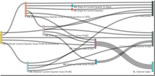
Once all the data was loaded into the model, I could use one of PowerBI’s custom visuals from the PowerBI Gallery – the Sankey Chart with Labels
Here is also an interactive version using the Publishing Feature of Power BI:
You can use the Slicers to filter on the Table, the Calculation Type and the Calculation itself and the visual shows all the dependencies down to the physical objects being Tables and Columns. This makes it a lot easier to understand your model and the dependencies that you built up over time.
I attached the sample-PowerBI-file below. You simply need to change the connectionstring to your SSAS Tabular Server and refresh the data connections.
The PowerBI-file (*.pbix) can be downloaded here: SSAS_CalcDependencies.pbix